Tag archieven: digitale layout

SCRAPBOOK LAYOUT – HIWHI | IIWII

Ik vind het heerlijk om met digitale elementen en papier te spelen en dingen te laten gebeuren. Het is een geweldige en schone manier om te experimenteren met kleur en compositie. Er is altijd genoeg en het geeft geen rommel. Lekker laagdrempelig dus!

Als abstract (non figuratief) mixed media beoefenaar valt het niet mee om met niets te boeien. Als de compositie en kleuren rammelen, dan wordt het niets. Hetzelfde geldt ook voor scrapbook zonder foto’s. Zonder centerpiece is het werk zielloos en leeg. Als werk niet als nuttig of als een reflectie van de realiteit bestempeld kan worden, ben je de mainstream over het algemeen al gauw kwijt. Een kunstwerk zonder hart is dood. Er valt nog heel wat over dit onderwerp te zeggen en te beargumenteren. Dat leg ik voor nu even lekker naast me neer.

In ieder geval, om er voor te zorgen dat m’n zicht op compositie, kleurwaarden en kleurgebruik beter wordt, is het heel leuk en nuttig (ja,ja) om digitaal met “niets” iets te maken. Gewoon wat elementen die aanspreken gebruiken en heerlijk schuiven totdat het beeld plezierig is om naar te kijken. Heerlijk en ontspannen om te doen. En weet je wat het leuke hieraan is? Het Is Wat Het Is (HIWHI)… En het ziet er achteraf naar uit – als ik mijn werkstuk nader bekijk – dat ik een doorbraak heb bereikt door buiten m’n kader te treden en op weg ben naar het grote onbekende.

“En het ziet er achteraf naar uit – als ik mijn werkstuk nader bekijk – dat ik een doorbraak heb bereikt door buiten m’n kader te treden en op weg ben naar het grote onbekende.”

Lekker hoor die ongestructureerde chaos! Het zal mij benieuwen waar dit avontuur me brengt. In ieder geval, de kramp is er uit!


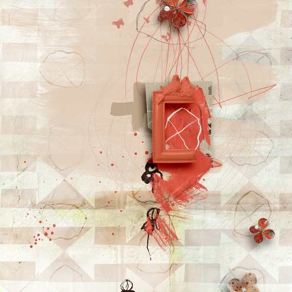
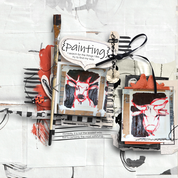
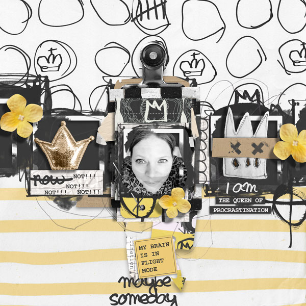
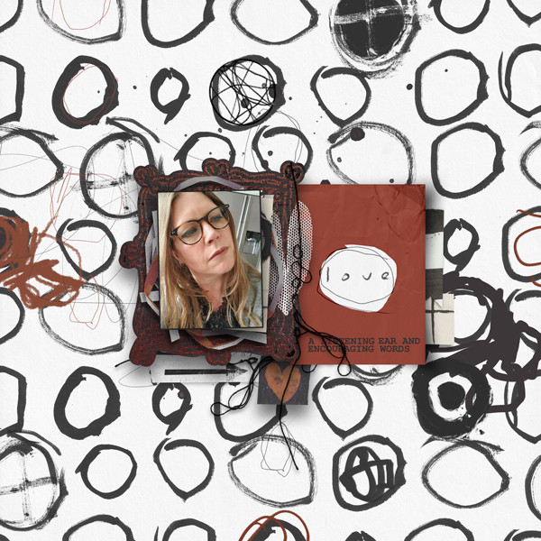
I love playing with digital elements and paper and making things happen. It’s a great and clean way to experiment with color and composition. There’s always plenty and it doesn’t create a big mess. So nice and easy accessible!

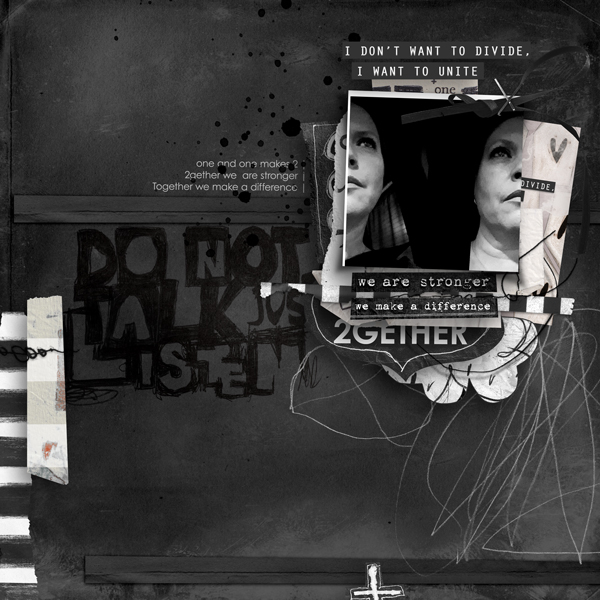
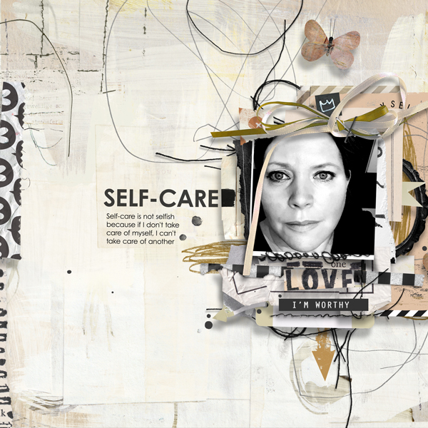
As an abstract (non figurative) mixed media practitioner, it’s not easy to captivate with nothing. If the composition and colors are crap, it will be nothing. The same goes for scrapbook without pictures. Without a centerpiece, the work is soulless and empty. If work cannot be labeled as useful or as a reflection of reality, you generally lose the mainstream quickly. A work of art without a heart is dead. There is a lot to say and argue about this subject. I will set that aside for now.

In any case, to make sure that my understanding of composition, color values and use of color improves, it is so much fun and useful (yes,yes) to make something digitally with “nothing”. Just using some elements that appeal and shifting around until the image is pleasing to look at. Delightful and relaxing to do. And you know what the fun part of this is? It Is What It Is (IIWII)… And in retrospect, it looks – when I review the work I have made – that I have made a breakthrough by stepping out of the box and heading into the great unknown.

“And in retrospect, it looks – when I review the work I have made – that I have made a breakthrough by stepping out of the box and heading into the great unknown.”

Great, this unstructured chaos! I wonder where this adventure will take me. In any case, the cramp is gone!

SCRAPBOOK LAYOUT – TOGETHER TEMPLATES

Ik vind templates heel handig voor een snelle start. Als voorbeeld heb ik in de lay-outs hieronder drie verschillende SPPP collecties ieder met de Together templates kit gebruikt. De eerste collectie die ik heb gebruik is Find Your Way, de tweede (meer dramatisch) is Both Sides en de laatste is More Self-love Please.


I find templates very handy for a quick start. As an example, I have used three different SPPP collections each with the Together templates kit in the layouts below . The first collection I used is Find Your Way, the second (more dramatic) is Both Sides and the last is More Self-love Please.

SCRAPBOOK LAYOUT – PROCRASTINATION

Deze onderstaande layout heb ik in Photoshop gemaakt met de SPPP Procrastination collectie. Deze layout, gaat net als de hele collectie over uitstelgedrag. Iets waar ik regelmatig mee te dealen heb…

Persoonlijk houd ik van rommelige layouts met een duidelijke boodschap, waarin niets perfect of clean is. Het leuke hieraan is, dat elke ontwerper een eigen smaak en visie op scrapbook heeft, waardoor er altijd wel een stijl is die jou aanspreekt. Je kunt met de *BBD (Berry Big Deal) voordelig collecties aanschaffen van verschillende designers. Het voordeel hiervan is, dat alle designers het zelfde kleurschema gebruiken waardoor de collecties qua kleur perfect bij elkaar passen. Zo kun je een geheel je eigen mix maken en je eigen stijl ontwikkelen.

Kijk hier eens in de shop bij de ontwerpers van Pickleberrypop en hier in de Pickleberrypop gallery waar onze super creatieve klanten en de *creatieve teamleden hun creaties tonen.

*BBD (Berry Big Deal): Eke 3e dinsdag van de maand komt Pickleberrypop met een winkelwijde BBD sale. Alle designer collecties zijn gemaakt met hetzelfde kleurpalet waardoor de collecties onderling goed gecombineerd kunnen worden.

*CT (Creative Team): Het creatieve team helpt de ontwerpers aan mooie layouts. Het zijn zeer getalenteerde dames en heren met heel veel ervaring op het gebied van (digitaal) scrapbook.


I created this layout featured below in Photoshop using the SPPP Procrastination collection. This layout, like the whole collection is about procrastination. Something I have to deal with on a regular basis….

Personally, I like messy layouts with a clear message, where nothing is perfect or clean. The great thing about this is, that each designer has their own taste and vision of scrapbook, so there is always a style that appeals to you. With the *BBD (Berry Big Deal) you can buy collections from different designers at a discount. The advantage of this is that all designers use the same color scheme so the collections match perfectly. In this way you can create your own mix and develop your own style.

Check out the Pickleberrypop designers’ shop over here and here in the Pickleberrypop gallery here where our super creative customers and the *creative team members show their creations.

*BBD (Berry Big Deal): Every 3rd Tuesday of the month, Pickleberrypop comes out with a store-wide BBD sale. All designer collections are made with the same color palette making the collections easy to mix and match.

*CT (Creative Team): The creative team helps the designers by creating beautiful layouts. They are very talented ladies and gentlemen with a lot of experience in the field of (digital) scrapbooking.

SCRAPBOOK LAYOUT – HEART WARMING WINTER

Deze onderstaande layout heb ik in Photoshop gemaakt met de Heart Warming Winter collectie. Het voordeel van een programma als Photoshop is dat je met lagen werkt. Door elk element schaduw te geven, ontstaat er diepte net als bij “echt” scrapbook werk. Digitale layouts kunnen overal in- en op afgedrukt worden zoals op kaarten bijvoorbeeld, in een fotoboek, op een canvas of op textiel… Met het huidige aanbod van fotoproducten zijn er heel veel leuke en interessante mogelijkheden om van je digitaal gemaakte layout iets persoonlijks, tastbaars en bijzonders te maken.

I created this layout listed below in Photoshop using the Heart Warming Winter collection. The benefit of a program like Photoshop is that you work with layers. Shading each element creates depth just like “real” scrapbook work. Digital layouts can be printed in and on anything such as cards for example, in a photo book, on a canvas or on fabric… With the current range of photo products, there are lots of fun and interesting possibilities to turn your digitally created layout into something personal, tangible and very special.